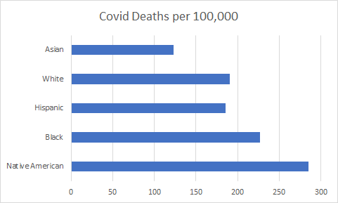
CDC is misleading the public by reporting “per 100,000” rather than actual numbers. The chart above makes it look like the Native American population is being ravaged by Covid-19, but is misleading due to small percent of total population.
Per 100,000 is a rate, not an actual number. It is only good for comparing within a fixed population/ group, not between different sized populations/groups. This applies to different racial/ethnic groups, age groups, states, counties. The smaller the total population, the larger the “per 100,000” appears. If a population is 10 and only 1 is affected, that is 10,000 per 100,000. If the population is 1000 and 1 is affected, that is 100 per 100,000. The technique magnifies results in smaller populations and reduces results in larger populations.
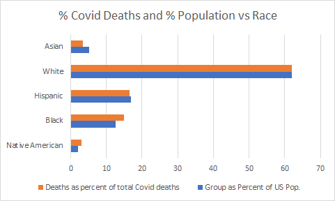
Example: January, 2021 data from USAfacts.org reported deaths per 100,000 by ethnic group. Each group has a different size and percent of total population. Deaths per 100,000 is reported so that Native Americans appear to be the most affected by far because the population is relatively small. See table below.
| Ethnic Group | Group Population | Group as Percent of US Pop. | Covid Deaths per 100,000 | Number of Covid Deaths | Covid Deaths as percent of total deaths |
| Native American | 6,371,200 | 2 | 285.1 | 18,164 | 3.0 |
| Black | 40,138,560 | 12.6 | 227.1 | 91,154 | 15 |
| Hispanic | 53,836,640 | 16.9 | 185.7 | 99,975 | 16.5 |
| White | 197,507,200 | 62 | 190.8 | 376,843 | 62 |
| Asian | 16,565,120 | 5.2 | 123 | 20,375 | 3.4 |
By converting the per 100,000 results reported into actual numbers and percentage of the total deaths, the picture is quite different and similar to the percent of US population for each group. The huge disparity has disappeared. Blacks and Native Americans appear to be slightly more affected, while Hispanics and Asian are slightly less affected than their population.